Monday, December 13, 2010

Project 4 Final

Illuminated Letter: Contemporary Counter Part

Project 4 description:
After learning and understanding the history of illuminated letters we picked three different artists and made a drop cap with their first name initial or last name initial which was inspired by their art work.

The object of this project was to create a series of illuminated letters based on the visual language of the artist(s), architect(s), or designer(s) that we chose. We chose three artists and an artwork of theirs and transformed it into a drop cap with the artists first name initial or last name initial.


Art work by Joan Miro:
Drop cap inspired by Joan Miro:
Final Layout for Joan Miro drop cap:
Art work by Paul Klee:

Drop cap inspired by Paul Klee:
Final Layout for Paul Klee drop cap:
Art work by Jean Carlu:
Drop cap inspired by Jean Carlu:
Final layout for Jean Carlu drop cap:
Project Overview:
I enjoyed working on this project because it was very short and simple. As well, I had a lot of fun sketching and coming up with so many drop cap ideas for each artist. Plus, looking at the artwork next to the designed drop caps is really cool because you can see what elements were taken from the drop caps. The best part of the project was taking the sketches we made and creating them on the computer. Overall, I enjoyed this project and had no problems throughout it, I would like to do it again for more artists.

Sunday, November 28, 2010

Color Studies and Word Lists

Final three artists and color studies:


Books I checked out from the library:

ND 813 M5 A4 2008b - Joan Miro: painting and anti-painting 1927-1937
NC 1850 C38 A4 1980 - Retrospective Jean Carlu: Musee de l'Affiche..fo
folio ND 588 K5 G75- Paul Klee
folio ND2900 R63 -Art of the Illuminated Manuscript

Jean Carlu:
Advertisments
Bold
Blocky
Repetition
Colorful
Right Angles
Small Details
Tilted
Drop Shadows
Playful
Creative
Modern

I chose Jean Carlu because his work is very unique and the style he uses combines his illustrator and graphic designer skills. Many of his works are advertisements, but are well thought out advertisements. His blocky and use of straight lines is what I really enjoy about his work.

French illustrator and graphic designer, born in Bonnieres-sur-Seine. A student of architecture at the Ecole des Beaux-Arts in 1918, he redirected his interests toward the fields of graphic art and exhibition design after the amputation of his right arm. By 1931 he had achieved international recognition as an advertising illustrator. In 1937 he acted as chairman of the Graphic Publicity Section of the Paris International Exhibition, and three years later, was sent by the French government to the United States where he remained for the next thirteen years. In the States he was employed by the Office of War Information to design defense posters, and was connected with various groups of La France Libre. He also worked for a number of American firms, and designed commercial and educational exhibitions for the United States, commissioned by the French government. He was the International President of AGI from 1945 to 1956 and retired in 1974. Carlu died in Nogent-sur-Marne, France in 1997.

Paul Klee:
Shapes
Colorful
Abstract
Pattern
Squarish
Basic
Basic Shapes
Straight lines
Transparent
Fluent
Wavy
Rectangular

I chose Paul Klee because his work is very simple but very complex to recreate. He uses a lot of basic shapes in his work and always finds a way to create depth within them. What really caught my attention was the way he made his works abstract just by using simple shapes. Lastly a main reason I chose Paul Klee was because he uses a lot of transparent to give his work a different vibe.

Paul Klee was born in Münchenbuchsee near Bern on 18 December 1879. In 1898 he decided to move to Munich, where he studied etching and drawing under Heinrich Knirr. Two years later Klee began to study painting at the Munich Art Academy under Franz von Stuck. His first travels took the painter to Rome in 1901/02 and, in 1905, to Paris. Klee's subtly differentiated moods range from laughter to tears. His witty titles are often as important as the paintings themselves, which combine an economy and precision of technique with the markings of a seemingly limitless imagination. Klee taught at the Bauhaus from 1921 to 1931 and then became professor of Fine Arts in Düsseldorf. In 1933, nine of his works were included in the degenerate art exhibition, the Nazis invaded his studio, and he was suspended from his post. Luckily, Klee was able to take his paintings, drawings, and writings with him when he sought refuge in his native Berne, where he continued to work until his death in 1940.

Joan Miro:
Playful
Abstract
Bold
Circular
Random
Colorful
Basic strokes
Messy
Dots
Transparent
Single lines
Fluent
Stars

I chose Joan Miro because I remembered studying him in art history and enjoyed the way he played with line and shapes. His work is very unique and different from many artists. As well, he uses a style that can be recreated in many different ways. Lastly, I enjoy the way he includes abstractive shapes with the lines.


Joan Miró, was born in Barcelona in 1893 and died in Mallorca in 1983. He produced works in a variety of different styles, and using a wide range of materials, but the majority of them had a surrealist flavour. This is how he is best remembered, although he preferred to think of his works as individualistic, and not necessarily falling into any particular category. In the late 1950s, Miró began to produce commissioned works, particularly murals and large outdoor sculptures for locations around the world. In 1972, a building to house the Fundació Joan Miró, Centre d'Estudis d'Art Contemporani (The Joan Miró Foundation, Centre for the Study of Contemporary Art) was commissioned. It opened to the public in 1975, and it houses the largest collection of Miró’s works. This is by far the biggest collection in the world, not surprisingly because Miró himself donated the vast majority of pieces before he died. It includes 240 paintings, 175 sculptures, 9 textiles, 4 ceramics, the almost complete graphic works, and around 8,000 drawings. Other examples of Miró’s work can be found at museums and locations around the world.

Saturday, November 27, 2010

From Six to Three Artists

My first original six artists were; Joan Miro, Wassily Kandinsky, Jackson Pollock,Edgar Degas, Paul Klee and Jean Carlu.


My final three with the top 5 images are:

Jean Carlu:


Paul Klee:


Joan Miro:


Tuesday, November 16, 2010

What is an Illuminated letter?

An illuminated letter was usually the first letter of a page or paragraph. It was always enlarged and in color with gold applied in areas, while the rest of the text remained black. The images used to enhance the letters include animals, plants, and mythological creatures. These images were modified to fit into or around the letter, or in some cases took on the shape of the letter itself. A drop cap is an enlarged, often decorative capital letter at the beginning of a paragraph, chapter or publication.


Here are examples:


Saturday, November 6, 2010

Cool Infographic

I know we're done with infographics, but I was browsing and found this really cool one:

Friday, October 22, 2010

Cool Motion Video using Type & Weather!

Hey everyone,


While I was looking for motion type videos I came across this video that is really cool and uses type for the weather. Check it out:

Thursday, October 7, 2010

Vote on my poll, please!

Hey everyone,
My poll is posted to the right of this! Thanks for taking the time to vote!

Monday, October 4, 2010

FOLIO

Folio Background

Folio is classified as a geometric sans serif or a realist sans serif and was designed by Konrad Bauer and Walter Baum in 1957. Like Helvetica and Univers, which were also released at the same time, it is part of the International Typographic Style and modeled after Akzidenz-Grotesk. However, Folio is more closely modeled on Akzidenz-Grotesk than the other two, which have larger x-heights. Due to good marketing, the typeface experienced moderate success in the United States. The typeface family was extended in 1963, adding an Extra Bold weight and a Bold Condensed width. Some distinguishing features of the typeface are the capital Q's tail is centered under the figure, the uppercase J has a slight hook, and there are two versions of uppercase R, one with a straight tail and one with a curved tail.

Sans Serifs can be found in history as early as the 5th century, although the classical revival of the Italian Renaissance return to old style serifed typefaces made them virtually obsolete until the 20th century. The first known usage of Etruscan sans-serif foundry types was from Thomas Dempster's De Etruria regali libri VII (1723). Later at about 1745, Caslon foundry made its the first sans-serif types for Etruscan languages, which was used by University Press, Oxford, for pamphlets written by Etruscan scholar John Swinton.

In late 18th century, Neoclassicism movement led to architects to increasingly incorporating ancient Greek and Roman designs in contemporary structures. Among the architects, John Soane was noted for using sans serif letters on his drawings and architectural designs, which were eventually adopted by other designers, such as Thomas Banks, John Flaxman. Sans-serif letters began to appear in printed media as early as 1805, in European Magazine. However, early 19th-century commercial sign writers and engravers had modified the sans-serif styles of neoclassical designers to include uneven stroke weights found in serif Roman fonts, producing sans-serif letters. The term Sans-serif was first employed in 1830 by Figgins foundry.

Their was much development of sans-serif typefaces in Germany as a revolt against the ornate lettering of the popular Blackletter styles which led to sans-serif typefaces based on the purity of geometric forms.

Sans serif type was used almost exclusively for display type and continued as such into the early twentieth century. Then, typographers associated with the German Bauhaus movement began designing and using sans serifs for texts. The oppressive German government forced many designers who used this new typography to flee. In modern typography, sans serif faces are widely used to convey a modern or progressive feeling. Sans serif was being created during the industrial revolution and communication brought posters and flyers to the forefront of society, with a need for bold printing types that could grab attention. It was proved to be effective in commanding a reader’s attention.

Geometric Sans-serif typefaces were influenced by the Bauhaus movement and feature circular or geometric letters, with little variation in stroke thickness. The area around the letters usually forms some type of geometric shape. As well, they first appeared in the early 1920s. Initially designed as an alternative to the difficult to read German fraktur, geometric types depended on clean legible forms. The first half of 20th century is the end of the Modern era, the moment when revived typefaces were flooding the typography mainstream. But it was also the time when a completely different font design was booming, called sans serif a type that does not have serifs and it is French for “without serifs.” It wasn't an absolutely new idea at that time, since first sans serif faces had appeared in the beginning of 19th century; but never before this seemingly peripheral and exotic trend claimed so much importance as in 1920s and 30s. Typefaces within each classification of sans serif usually share similarities in stroke thickness, weight, and the shapes of certain letterforms. The German Bauhaus movement of 1920s (influenced by earlier Russian constructivism), required adequate means of typographic expression. These movements stressed utilitarian aspects in design, claiming that a thing becomes beautiful only when and because it serves a practical purpose, denying any attempts to artificially "adorn" it. Also notable is the precise minimalism of these designs. The characters almost always are made up from straight horizontal and vertical lines, and arcs that are very circular ( to the point where they often look as though they were drawn with a compass ).

Bauer licensed the design to Fonderie Typographique Francaise for sale in France under the name Caravelle. Folio benefited from the promotion of the excellent sales agency that Bauer had long retained in the United States. It also became available for the linecasting machine when adopted under a royalty agreement by the Intertype Corporation. Folio was one of the first popular Swiss Sanserif; the positive black shapes of the letters appear to be locked inevitably into the correct position by the firm and positive white shapes that surround them. The typeface family was extended in 1963, adding an Extra Bold weight and a Bold Condensed width. The designers based their ideas on Helvetica but Folio did not turn out to pose the competition they had hoped. The font has the same applications as Helvetica and is an extremely legible font. Folio is particularly good for text and has an objective, neutral character. Folio is based on 19th-century German models, and Fortune, the first clarendon to have a companion italic. Geometric sans serifs have the illusion of ‘monoline’ letter construction. As well, classic proportions mostly appear in geometric sans serifs. Geometric fonts tend to be the least useful for body text. Lastly, according to some sources Folio can also be known as a realist sans serif and has some characteristics of neo-grotesque because of its letter E and O.

Biography of Konrad Bauer and Walter Baum

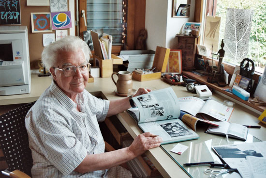
The designers of the font, Folio were Konrad Bauer and Walter Baum. Konrad Bauer was a mid-twentieth century director of the Bauer type foundry in Germany, where he was deeply involved in the production of new typographic designs. Bauer was born into a printing family in Hamburg, Germany in 1903, he trained as a typesetter and studied art history. He finished his studies with a doctorate, specialized in the history of lettering, and learned calligraphy, before serving a printer’s apprenticeship. His whole working life was concerned with type and printing; he even continued to work with the Bauer Type foundry after his retirement. The Bauer Type Foundry was a German type foundry founded in 1837. The company nearly went bankrupt at the end of the 19th century because the company's administration assumed that type founding, rather than typesetting, would be automated. The new owner, Georg Hartmann succeeded in saving the company. Subsequently, the company grew, also due to several takeovers, e.g. in 1916 by Frankfurt's type foundry Flinsch, itself a global player. In 1927, an office was opened in New York.He died in Schönberg, Germany in 1970, aged 66.

Bauer first began working at the Bauersche Gießerei in Frankfurt am Main in 1928, and he continued to be associated with the foundry throughout his life, rising to become its art director in 1948. He also worked in various other positions, including from 1932 until 1936, as a member of the editorial staff for the Zeitschrift für Bücherfreunde (a monthly magazine for bibliophiles) and between 1938 and 1940 he was the editor of the Imprimatur yearbook. From its inception in 1952 until 1964, he headed the jury of Die schönsten Bücher Deutschlands, a competition searching for the most beautiful book in Germany. He also taught book design, type and printing at the University of Mainz in the late 1940s. Bauer was interested in the history of printing and wrote several books, pamphlets and articles. He taught book design and printing at the University of mainz.

Walter Baum was born in Gummersbach, Germany in 1921 and died in 2007, he worked variously as a type designer, graphic artist, and teacher. He trained as a typesetter before studying at the Meisterschule für das gestaltende Handwerk (school for creative trades) in Offenbach. With his studies complete, he joined Frankfurt's Bauersche Gießerei, where he eventually became director of its graphic studio. in 1949, Baum joined Bauersche Giesserei in Frankfurt am main, where he became dierector of the graphics studio and collaborated with Konrad F Bauer on many type projects. From 1972 until 1986 he was the owner and director of Kunstschule Westend (Westend Art School) in Frankfurt am Main.Overall, Walter Baum was known as a type designer, graphic artist, and a teacher.

Konrad Bauer and Walter Baum, he designed several fonts, including Alpha, Beta, Folio, Imprimatur, Volta, Verdi, and Impressum. As well, they designed fonts with each other and did not design any individually. Lastly, they also designed the font Impressum together in 1963, which became very popular with newspaper publishers.

What happened around 1957

The Korean war went on from 1950-1953. The Vietnam War began in 1959. The world's first nuclear power plant was opened in Obninsk near Moscow. An immunization vaccine is produced for polio. Rock and Roll emerged in the mid-50s as the teen music of choice with Sam Cooke, Jackie Wilson, Gene Vincent, Chuck Berry, Fat Domino, Little Richard, James Brown, Bo Diddley, Buddy Holly, Bobby Darin, Ritchie Valens , and Ricky Nelson being notable exponents. In the mid-1950s Elvis Presley became the leading figure of the newly popular sound of rock and roll with a series of network television appearances and chart-topping records. In the early 1950s Jackson Pollock and Willem de Kooning were enormously influential. Pop Art used the iconography of television, photography, comics, cinema and advertising. With its roots in Dadism, it started to take form towards the end of the 1950s when some European artists started to make the symbols and products of the world of advertising and propaganda the main subject of their artistic work.

Overall, I do believe that what was happening influenced the design of Folio, because the world was changing rapidly and becoming more involved with art. People were starting to express themselves more and were starting to change the world through art and music. Since Folio was made in 1957, I believe that Bauer and Baum were influenced by all of the new media that was starting to come out and so they wanted to make a font to fit well in communicating messages through the media.

Bibliography

An A-Z of Type Designers by Neil Macmillian

Anatomy of a Typeface by Alexander S. Lawson

Designing Type by Karen Cheng

http://www.identifont.com/show?196

http://www.webreference.com/dlab/9802/sansserif.html

Wednesday, September 29, 2010

Font Classifications 9/29

Old Style- Old style is also called Gerald and its origins is in Renaissance humanism. The main characteristics are slight diagonal stress, shorter x-height, and scooped serifs. Lastly it is based on handwriting.


Transitional- Transitional is a refinement of Old Style form. The main characteristics are very slight diagonal stress, bracketed serifs, and tall x-height.


Modern- Modern is also called Didone.The appearance is technical exact. The main characteristics are flat unbracketed serifs, hairline serifs, no horizontal stress, and has no influence by handwriting.


Slab Serif- Slab serif is also called Square serif. The main characteristics are mono weight, square ended serifs, no stress, bold machine like, rectangular, geometric impact, and uniform serifs.


Sans Serif-
Sans serif has three different classifications within it; Geometric, Humanist, and Grotesque. It has no serifs (without strokes at the tops and bottoms of letters). They are most often used for sort text components such as headlines or captions.


Script-
Script is based on handwriting. It is fluid and formal and looks similar to cursive writing. They are best used for decoration.


Blackletter-
Blackletter is a style of typeface that features elaborate thick to thin strokes and serifs. It is most often seen on diplomas, certificates, formal invitations, etc.


Grunge - Grunge is influenced by punk, rock, and heavy metal. It’s dirty, aggressive, and disorganized.


Monospaced-
is a typeface in which each character is given the same width (as by a typewriter).


Undeclared-
Undeclared are a mix of font classifications. As well, they are unable to distinguish.

Wednesday, September 8, 2010

Adrian Frutiger

http://www.thescienceofcreativity.com/upload/media/1211621581_frutiger.jpgAdrian Frutiger was born in Unterseen near Interlaken, Switzerland in 1928.From 1948 to 1951, Frutiger went to study sculpture, graphic design, and illustration at the Zurick Kunstgewerbeschule. A year later, he began to work for Deberny and Peignot type foundry in Paris. In 1957, Frutiger created Univers, which was supposed to be as reticent and neutral as possible, so that it would be universal in application. Currently, it is one of the most widely used standard typefaces. He also created Frutiger, which was commissioned by Charles De Gaulle International Airport. Motorway signs are in Frutiger in France and Switzerland. Throughout his career, he developed more than one hundred and seventy typefaces. Many of his typefaces are used daily and shape reading habits. Most of them have become standard fonts that are used on a daily basis. He lived most of his life in Paris, where he worked as a typographer and taught illustration and typography at École Estienne and the École Nationale Superieure des Arts Décoratifs. In 1986 he received the Gutenberg Prize of the City of Mainz and a year later he received the Medal of the Type Directors Club of New York. Frutiger has received many awards throughout his career. As well, he is known as one of the greatest typographers and typeface designers of the 20th century.

What makes Univers so unique is that the Univers family consists of 44 faces, with 16 uniquely numbered weight, width, position combinations and also 20 fonts have oblique positions. As well, it was created by Frutiger with clarity, which makes it easily readable. Frutiger also created a unique numbering system to help identify the variety typefaces within Univers and to eliminate the confusion.

The Univers grid organizes and shows the many width, weight, and position combinations within the univers family.

http://im.typotheque.com/static/Univers.png

http://www.thescienceofcreativity.com/upload/media/1211621581_frutiger.jpg

http://im.typotheque.com/static/Univers.png

http://en.wikipedia.org/wiki/Adrian_Frutiger

http://en.wikipedia.org/wiki/Univers

http://www.identifont.com/show?110

http://www.kettererkunst.com/bio/adrian-frutiger-1928.shtml

Sunday, August 29, 2010

Visc 202 Answers for 8/25

In regards to alphabet variation define....


Weight- The weight is the quickest, most efficient, and most traditional way of calling attention to a word, sentence or paragraph. As well, it is the relative darkness resulting from a the thickness of strokes.


Width- Condensed/compressed and wide/extended are the most common widths.


Style- Style can be classified into serif and sans serif and is a simple term that defines the decorative qualities applied to the text.


In regards to measuring type...


How is type measured in inches, mm, points or pica- type is measured by 1inch=12picas=72points.

As well, the type size must work together with linespacing. Linespacing is the space between the lines of type, measured from the baseline of one line of text to the next line of text.


Define point-Is a unit of measurement that is used for measuring type and is used for measuring depth of printing.


Define pica- Is a unit of measurement which usually measures lines of type.


How many points in an inch? There are 72 points in an inch.


If a letter is set in 36 pts about how many inches tall is it? The letter is 0.5 inches tall.


How many picas in an inch? There are 6 picas in an inch.


How many points in a pica? There are 12 points in a pica.


Define x-height- It is the distance between the baseline and the top of the main body of a lower case letter. It plays a huge part in typeface identification and readability.


Define cap height- Is the height of the capital letterforms. It mainly refers to flat letters opposed to round and pointed letters.


Define leading- It is the space between lines of type. It is usually expressed in points and measured from baseline to baseline.

Tuesday, August 24, 2010

Visc 202 Answers

Define "Grid:"


A grid is an approach to solving the problems on visual and organizational levels. It is also used to solve communication problems that have a high complexity level. The grid consists of a discrete set of alignment based relationships that serves as a guide for placing elements across an appearance. Lastly, a grid consists of columns, modules, markers, spatial zones, flowlines, and margins.


Why do we (designers) use a grid? What are the benefits or functions?


Designers use a grid because it is a simple approach to help them solve organizational and visual problems. As well, it helps solve communication problems that are very complex. The grid permits a designer to lay out a large amount of information because the building of the grid’s structure is put into consideration.


What is a modular grid?


A modular grid is a grid with four rows and four columns.


Define and Illustrate:


Margins are the negative spaces between the format edge and the content, which encircle the live area where type and image will be positioned. The size of the margins bear some consideration and can be used to focus attention or serve as a resting place for the eye.


Columns are vertical alignments of type that create horizontal divisions between the margins. There can be any number of columns; sometimes they have the same widths and other times they do not depending on the specific kinds of information that will be provided.


Grid modules are individual units of space separated by regular gaps that, when repeated across the page, create columns and rows.


Flowlines are alignments that separate the space into horizontal bands. They help guide the eye across the format and can be used to impose additional stopping and starting points for text and images.


Gutter is the blank space between facing pages of a book or between adjacent columns of type or stamps in a sheet.


Define hierarchy:


Hierarchy is determined on the level of importance that each part of the text is assigned to. It is based on which part of the text should be read first and the designer makes sure that the text is the first thing the viewer sees.


Define typographic color:

Typographic color is the changes in weight, texture or value, and rhythm which help indicate the differences between elements. The smaller and lighter elements which appear to recede, decrease in comparative importance because they become less active within the composition.


What are ways to achieve a clear hierarchy?


One way to achieve clear hierarchy is by manipulating the spaces around and between text, the designer creates levels of importance As well, changing the weight, texture or value, and rhythm helps indicate the difference between elements,which is also implied by spatial separation.