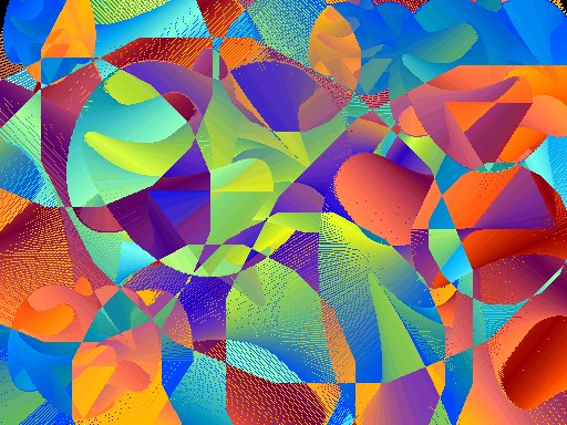
Final three artists and color studies:

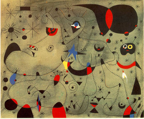
ND 813 M5 A4 2008b - Joan Miro: painting and anti-painting 1927-1937
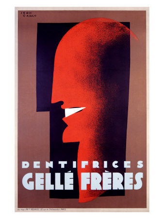
NC 1850 C38 A4 1980 - Retrospective Jean Carlu: Musee de l'Affiche..fo
folio ND 588 K5 G75- Paul Klee
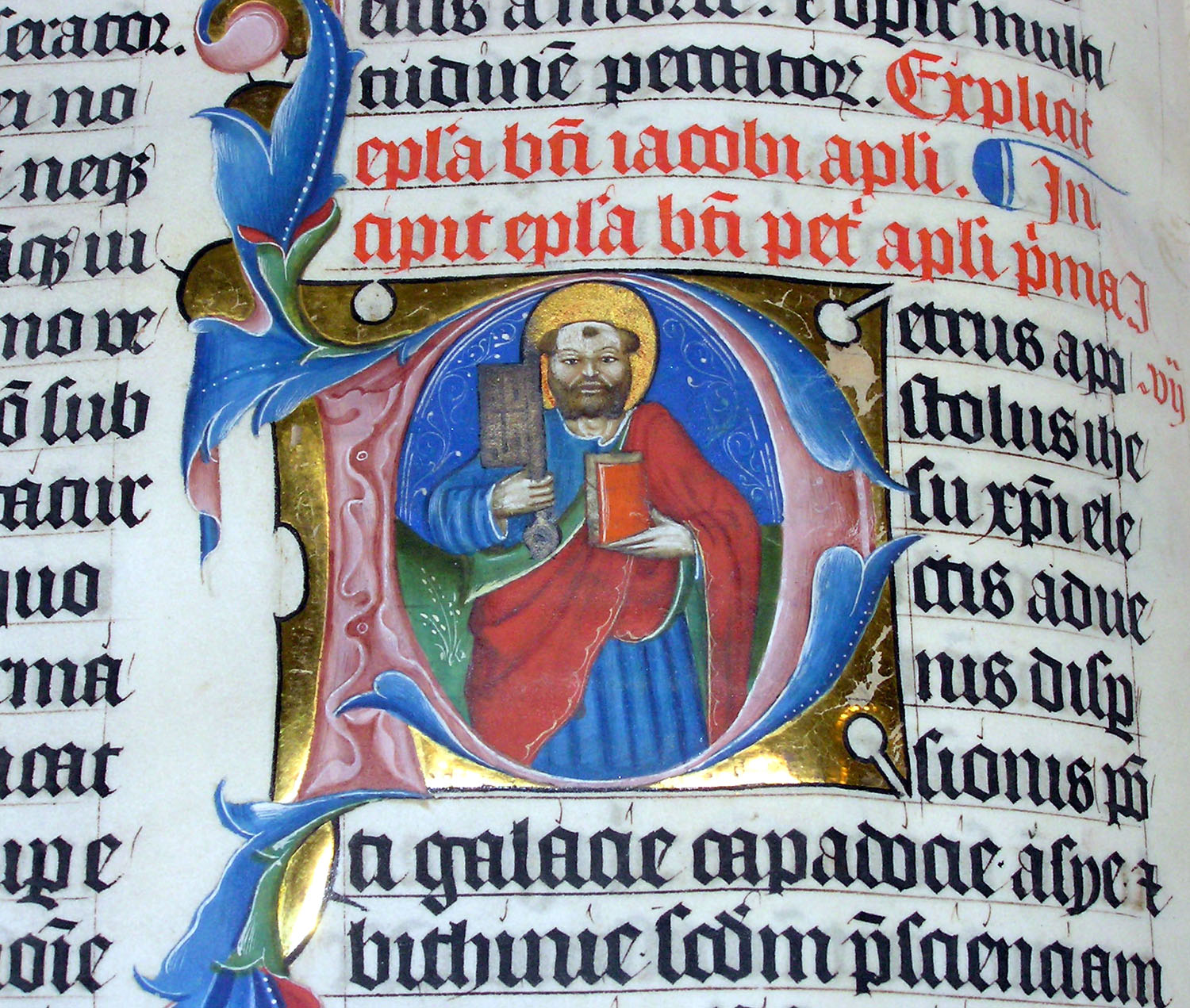
folio ND2900 R63 -Art of the Illuminated Manuscript
Advertisments
Bold
Blocky
Repetition
Colorful
Right Angles
Small Details
Tilted
Drop Shadows
Playful
Creative
Modern
I chose Jean Carlu because his work is very unique and the style he uses combines his illustrator and graphic designer skills. Many of his works are advertisements, but are well thought out advertisements. His blocky and use of straight lines is what I really enjoy about his work.
French illustrator and graphic designer, born in Bonnieres-sur-Seine. A student of architecture at the Ecole des Beaux-Arts in 1918, he redirected his interests toward the fields of graphic art and exhibition design after the amputation of his right arm. By 1931 he had achieved international recognition as an advertising illustrator. In 1937 he acted as chairman of the Graphic Publicity Section of the Paris International Exhibition, and three years later, was sent by the French government to the United States where he remained for the next thirteen years. In the States he was employed by the Office of War Information to design defense posters, and was connected with various groups of La France Libre. He also worked for a number of American firms, and designed commercial and educational exhibitions for the United States, commissioned by the French government. He was the International President of AGI from 1945 to 1956 and retired in 1974. Carlu died in Nogent-sur-Marne, France in 1997.
Paul Klee:
Shapes
Colorful
Abstract
Pattern
Squarish
Basic
Basic Shapes
Straight lines
Transparent
Fluent
Wavy
Rectangular
I chose Paul Klee because his work is very simple but very complex to recreate. He uses a lot of basic shapes in his work and always finds a way to create depth within them. What really caught my attention was the way he made his works abstract just by using simple shapes. Lastly a main reason I chose Paul Klee was because he uses a lot of transparent to give his work a different vibe.
Paul Klee was born in Münchenbuchsee near Bern on 18 December 1879. In 1898 he decided to move to Munich, where he studied etching and drawing under Heinrich Knirr. Two years later Klee began to study painting at the Munich Art Academy under Franz von Stuck. His first travels took the painter to Rome in 1901/02 and, in 1905, to Paris. Klee's subtly differentiated moods range from laughter to tears. His witty titles are often as important as the paintings themselves, which combine an economy and precision of technique with the markings of a seemingly limitless imagination. Klee taught at the Bauhaus from 1921 to 1931 and then became professor of Fine Arts in Düsseldorf. In 1933, nine of his works were included in the degenerate art exhibition, the Nazis invaded his studio, and he was suspended from his post. Luckily, Klee was able to take his paintings, drawings, and writings with him when he sought refuge in his native Berne, where he continued to work until his death in 1940.
Joan Miro:
Playful
Abstract
Bold
Circular
Random
Colorful
Basic strokes
Messy
Dots
Transparent
Single lines
Fluent
Stars
I chose Joan Miro because I remembered studying him in art history and enjoyed the way he played with line and shapes. His work is very unique and different from many artists. As well, he uses a style that can be recreated in many different ways. Lastly, I enjoy the way he includes abstractive shapes with the lines.
Joan Miró, was born in Barcelona in 1893 and died in Mallorca in 1983. He produced works in a variety of different styles, and using a wide range of materials, but the majority of them had a surrealist flavour. This is how he is best remembered, although he preferred to think of his works as individualistic, and not necessarily falling into any particular category. In the late 1950s, Miró began to produce commissioned works, particularly murals and large outdoor sculptures for locations around the world. In 1972, a building to house the Fundació Joan Miró, Centre d'Estudis d'Art Contemporani (The Joan Miró Foundation, Centre for the Study of Contemporary Art) was commissioned. It opened to the public in 1975, and it houses the largest collection of Miró’s works. This is by far the biggest collection in the world, not surprisingly because Miró himself donated the vast majority of pieces before he died. It includes 240 paintings, 175 sculptures, 9 textiles, 4 ceramics, the almost complete graphic works, and around 8,000 drawings. Other examples of Miró’s work can be found at museums and locations around the world.


.jpg)