Wednesday, September 29, 2010

Font Classifications 9/29

Old Style- Old style is also called Gerald and its origins is in Renaissance humanism. The main characteristics are slight diagonal stress, shorter x-height, and scooped serifs. Lastly it is based on handwriting.


Transitional- Transitional is a refinement of Old Style form. The main characteristics are very slight diagonal stress, bracketed serifs, and tall x-height.


Modern- Modern is also called Didone.The appearance is technical exact. The main characteristics are flat unbracketed serifs, hairline serifs, no horizontal stress, and has no influence by handwriting.


Slab Serif- Slab serif is also called Square serif. The main characteristics are mono weight, square ended serifs, no stress, bold machine like, rectangular, geometric impact, and uniform serifs.


Sans Serif-
Sans serif has three different classifications within it; Geometric, Humanist, and Grotesque. It has no serifs (without strokes at the tops and bottoms of letters). They are most often used for sort text components such as headlines or captions.


Script-
Script is based on handwriting. It is fluid and formal and looks similar to cursive writing. They are best used for decoration.


Blackletter-
Blackletter is a style of typeface that features elaborate thick to thin strokes and serifs. It is most often seen on diplomas, certificates, formal invitations, etc.


Grunge - Grunge is influenced by punk, rock, and heavy metal. It’s dirty, aggressive, and disorganized.


Monospaced-
is a typeface in which each character is given the same width (as by a typewriter).


Undeclared-
Undeclared are a mix of font classifications. As well, they are unable to distinguish.
Wednesday, September 8, 2010

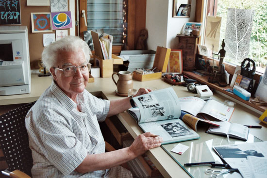
Adrian Frutiger

http://www.thescienceofcreativity.com/upload/media/1211621581_frutiger.jpgAdrian Frutiger was born in Unterseen near Interlaken, Switzerland in 1928.From 1948 to 1951, Frutiger went to study sculpture, graphic design, and illustration at the Zurick Kunstgewerbeschule. A year later, he began to work for Deberny and Peignot type foundry in Paris. In 1957, Frutiger created Univers, which was supposed to be as reticent and neutral as possible, so that it would be universal in application. Currently, it is one of the most widely used standard typefaces. He also created Frutiger, which was commissioned by Charles De Gaulle International Airport. Motorway signs are in Frutiger in France and Switzerland. Throughout his career, he developed more than one hundred and seventy typefaces. Many of his typefaces are used daily and shape reading habits. Most of them have become standard fonts that are used on a daily basis. He lived most of his life in Paris, where he worked as a typographer and taught illustration and typography at École Estienne and the École Nationale Superieure des Arts Décoratifs. In 1986 he received the Gutenberg Prize of the City of Mainz and a year later he received the Medal of the Type Directors Club of New York. Frutiger has received many awards throughout his career. As well, he is known as one of the greatest typographers and typeface designers of the 20th century.

What makes Univers so unique is that the Univers family consists of 44 faces, with 16 uniquely numbered weight, width, position combinations and also 20 fonts have oblique positions. As well, it was created by Frutiger with clarity, which makes it easily readable. Frutiger also created a unique numbering system to help identify the variety typefaces within Univers and to eliminate the confusion.

The Univers grid organizes and shows the many width, weight, and position combinations within the univers family.

http://im.typotheque.com/static/Univers.png

http://www.thescienceofcreativity.com/upload/media/1211621581_frutiger.jpg

http://im.typotheque.com/static/Univers.png

http://en.wikipedia.org/wiki/Adrian_Frutiger

http://en.wikipedia.org/wiki/Univers

http://www.identifont.com/show?110

http://www.kettererkunst.com/bio/adrian-frutiger-1928.shtml